Unit 33 Applied practice - Art and design wellbeing - Beth Munro
- Anthony Foster

- Jan 31, 2020
- 19 min read
Updated: Oct 15, 2020
Brief breakdown
For this unit as a class, we are put into two different groups and we all will be given the task to build and create a poster with a given theme. As a team, we will need to discuss with each other who will do each specific job role in-order for us to create the poster and complete the task.
We will need to complete a write up on three different artists that make us feel happy and explain how their work makes us feel happy, alongside this we also have to write a report about this project and talk about how we are going to go about it. Within the report, we need to discuss and share about two different artists who have worked within the given theme. Furthermore, we need to, in our groups make a PowerPoint and present it to the rest of the class. The PowerPoint needs to contain all information about who we are going to produce the poster for and the two different artists that we chose to look at within the report.
The three artists that make me happy
The Brief: Research three artists that makes me feel happy and say why you like their work. What photographer/artist and their work makes me feel happy and why I like it and what about their work makes me feel satisfied.
Artist 1: Annie Leibovitz (photographer)
I enjoy looking at Annie Leibovitz’s work since she is one of my all-time favourite photographers. I enjoy looking at her photography and reflecting on her career and seeing how far she has come as a photographer, from taking photos of herself and family to taking pictures of famous people like the Queen, Micheal Jackson and Demi Moore.
When I was looking around for a fine art photographer, I came across a photo of Micheal Jackson and it got me wondering who and how did someone manage to spend time with him to take his photograph; which ended up published in the Vanity Fair magazine. So I looked into other work of hers and, I came across the following image.
Leibovitz is well known for taking pictures of famous people, and some of the people are no longer with us. This allows people to look back through history and her work can show that these people did really live and are not made up, sadly unlike people who lived before painting and technology. I like how it is creating a history which will pay off in the long term.
I like to think that Annie type of portrait photography is a very fine art style towards her work
it gives a feeling of the seventeenth-century french portrait painters as some of her tones that use uses in her work.

Oil painting by Jean Auguste Dominique France painter from the seventeenth century I pick out this to show how her work compares to painters of a different artist. I pick out this one as it reminds me of one of the photography that she did for the Queen.

In regards to her signature style, ever since she advances in her career from taking photos for the rolling stones magazine and doing work for the bands all the way to her to doing a portrait of top big well-known celebrants where so would have some form of a landscape and the subject matter in the frame of the but she would put a twist into it by having an opposite side the model from the example above the Queen, normally she is seen as a kind, welcoming and bright person but the way that Leibovitz has portrayed the Queen just with the tones of the images and the angle that she shoots from this photography it shows her as dark, powerful and ruthless person which is the opposite to real life for these reasons this why I think of how she creative her signature style.
Artist 2: Jim Lee (a comic book artist for Marvel and DC comics.)
I picked out Jim Lee as an artist I enjoy looking at because I grew up liking his work, and it turned me into the fan of comic books and films I am today. From a young age, I started watching Marvels X-Men animations TV-series and seeing people who are born with different fighting to be excepted by the world around them. For me, I can relate it to my needs and acting differently compared to others around me. I enjoy reading comics that Jim Lee created. The illustration for Comic books plays a big part in the thing that I enjoy and have a big interest off.
What I really enjoy about the comics done by Jim lee is the way the illustration grabs my imagination and take me to another world because of the way he makes be and stay as iconic when people think of a character that he has been part of the illustration that any type of fans will straightway think off when it comes to comic book characters. secondly, I always feel amazed at how he manages to fit the about of detail of vibrant colours, moody tones and bold striking and great at fitting in a lot of details in small frames. Great at keeping the body portions the same no matter what size he having to work with and only having pencil, and ink to work with unlike today all illustration is done by detail.


Artist 3: Wally Pfister (Christopher Nolan's Cinematographer)
Wally Pfister is mainly known to a lot of people as the cinematographer for Christopher Nolan films such as the Batman trilogy; Batman Begins, The Dark Knight and The Dark knight Rises and other films such as Inception and Insomnia.
I love his control of light and shade, camera angles…
I do like how he managed to get focus on a wide-angle that he uses in the majority of the films that he is working on. I picked Pfister as his job role is something that I am keen to look into doing in the years to come and he works really hold my attention which keeps me happy when and watching the films that he has been part of to work on.
what picture or film was this in and what visual effect does it give? Do you like this effect And how does it make you feel, why does he use it, does he use it to good or dramatic effect?
For example: you wrote – “I do like how he got focus on a wide angle” – what picture or film was this in and what visual affect does it give? Do you like this effect And how does it make you feel, why does he use it, does he use it to good or dramatic effect?


Blog Entry 4: start of group work In support of a collaborative team.
As a class we need to express what makes us feel positive and feel negative then we had to discuss it to the class what makes us feel this way and why?


As a team, we came up with the theme of 'The Pursuit Of Happyness' as our main point of focus, we discussed and negotiated as a team many different ideas what we thought what would be the best way to present a final outcome what we think and agree would be a great way to our theme of 'The Pursuit Of Happyness'. Jake found out that the pursuit of happiness is a fundamental right that is in the declaration of independence. This means people have the right to do what they want as long as it doesn't harm other and it not illegal Firstly, we collected together a mind map of ideas on what we all think can be as a topic such as things like people getting along, signs of equality throughout a range of different people, promoting awareness towards mental health and how we could provide hope for people who might need a way of turning dark time into a time of enjoy. We had an idea of turning negatives into positivity. This could be shown by taking photographs of something that shows doom and gloom and then allowing the graphic designer of the group to add some illustrations on top of the images such as graffiti.
Jake also suggested tear aways posters that had quotes or compliments on them. This could have been a way of spreading to positives to improve peoples mood and feelings. Most of the group included myself felt like it wasn't a good idea as we don't feel like people would have taken it seriously. However, Amelia thought of a good idea to use things like music to improve people's wellbeing, therefore we decided to include a QR code that would lead them to a website that would have had many links for support including a playlist of songs for happiness.
My input to the group was that equality, pride and inclusivity are great features for healthy wellbeing. I feel that a lot of people normally benefit from having someone they can go to for comfort and support when they are having problems with their mental health. As knowing that you have got someone who is just willing to listen to you when you want to get your problems off your chest.
After having a look at how we can show the theme we managed to find an in-route we came up with the idea of sharing insecurities.
Blog Entry 5: Report
Title: This Is Me!
Introductions
The objective for this topic is to end up creating posters as a group to promote the given theme of insecurities. Throughout this report am going to discuss the effects of insecurities on mental health. This theme came from our first idea being what make us happy which evolved to the pursuit of happiness from this we managed to agree on the main theme of insecurities.
Everyone has something that they are insecure about, whether they can be seen or not, on the other hand it can have an effect on their mental health. Throughout this report we are going to explore the reasons why we care so much on what we look like and how having the littlest bit of insecurity can get us down.
The main focus for this project for us as a group to find out what makes people feel insecurities and how we can turn it into a positive.
Secondly, for this report I will be sharing two different artists who focus on insecurities to make people feel better about themselves. The first person that I picked out to discuss for this report is Steve Rosenfield.
Blog Entry 7 and 8: Both artist
Artist 1: Steve Rosenfield
The first artist I choice to discuss in this report is Steve Rosenfield because of one his projects called “What I be” this project is built up by a collection of images of people looking like they’re unhappy and they have text written on their hands or faces (or both).
This Project was started 12 years ago just as a social experiment and has now turned into a global movement about honesty and empowerment. It started with the hope to give people the chance to accept other people who suffer with something that is often seen as a weakness.
The title comes from one of his friends who is a musician, activist and poet. He wrote a song called “what I be” is basically all about being who you are.
“I am not my… I am more than meets the eye”
Each image is titled I am not my… (followed by what that person has been labelled) this shows the models with negative words written on their hands or faces to show there is more to them than just that label shown.
Artist 2: Leah Jones
For my second artist, I want to share in this report is Leah Jones is because I feel like links in well with this project since she did a similar approach for her end of year exhibition.
The main point of the exhibition was to showcase people’s insecurities about body image. By letting viewers wonder what the true insecurities are, for example, there is one person featured portraits showing off her body size by posing in a fitness pose and being happy about it, where it turns out that she was more insecure about her arms than her body size. This is shown by the pictures that were crossed out on the contact sheet along with a handwritten statement about what the focus of their insecurities was.
I was lucky to be asked to be a part of her project due to myself have my own things that I am insecure about.
Report reflection
My own opinion
Finding two different artists was difficult to find someone who promotes insecurities unit I came across my first artist as I feel strongly about his work fitting in nicely with the theme that we as a group are working with. The second artist portrayal of body image and shame encouraged us a group to explore the theme and what we see are final outcome of the project to be.
Conclusion
In an understanding of the project and the groups approach towards the theme of insecurities, we discussed how everyone has some form of something that they are shy to show even if it is visible or not and we all can relate to it. As I was involved in one of the artists exhibition I could give my own personal experience and how insecurity effect everyone. Both photographers show in their own unique way of making insecurities visible. This shows the viewers that it is okay to show your insecurities and it can even be empowering to share them.
Blog Entry 10 and 11: Planning and Creating the presentation

As a group, we had to put together a slide show and we present it to the rest of the class what are ideas where for this unit and what is are theme was and why we picked it. As a group, we are having to talk about 2 different artists/photography each and say why we think it links in with the given theme.

My role as a team was to help set up the PowerPoint and make sure that everything was in place ready for the presentation I also make it easy for everyone else as all they need. to do is just send into me their side of the information that they wanted in the PowerPoint during the time of putting this together as a group we had to send an email back and forth constantly updating our own part of the PowerPoint slides.
(Below has the final draft of the PowerPoint.)


Blog entry 12: Delivering the presentation
How I believe that the presentation went was really well I really enjoyed putting the PowerPoint together however I hated not knowing what to truly put in and understanding what everyone else was doing plus not all of the group was in at the same time when we planned to meet up and discuss about the presentation on the other hand what I feel that we could have done more on is practising the presentation and remembering what each person which part people wanted to talk about an and for me it was hard to stop talking to give other people the chance to talk. I think we did well delivering the presentation as we made sure that we talked about both of the artists that we choose to share I feel like it was organised as I had software on my Macbook that made it easy to build and create the PowerPoint.
During the delivery of the PowerPoint, I felt like I overdid it by talking too much which I believe which didn't give the other team member time to talk. this might be because I enjoy delivering a presentation and my passion for wanting to be a teacher might have got in the way.
Blog Entry 13: Idea development and creative for the poster
Project managing
what is the target audience
what the size of the poster will be
how can we promote
( These will be covered below.)
Time Management Plans
plan what the final outcome would be
choice who does what roles and what responsibilities they have
plan how we are going to approach the final outcome
plan what we need for the shoot
when the shoot will be ( These will be covered below.)
Roles and Responsibilities
As a group, we discuss the roles that were needed and decided which job roles go to the right person.
For myself, I was signed to the job role of the art director due to my confidence and my leadership skills. I felt that this position suited my skills, personality and charisma. During the group discussion, it was decided that my ambition to be a teacher fitted with this leadership role.
Billie is on a graphic design course and we felt that she was suitable for this role due to her experience. Her role as the graphic design will also involve doing the photo editing making sure that all the photos were the right size and change anything that might need a change.
Jake has a keen interest in fashion, and he was also working for the high street fashion retailer Next at the time of this project.
Both Chloe and Amelia wanted the role of being the photographer, so they came to compromise, Chloe is mostly a digital photographer in her main practice whereas Amelia prefers to work with film and other non-digital formats. Therefore, it made sense for Chloe the lead role of the being the photographer and Amelia to assistant.
Due to the fact of where I want to see myself in the future being a teacher, we as a group thought it was best for me to try out this role and help me to build on my leadership skills. I wanted a position for responsibility because I have fantastic communication skills and motivate my team.
The roles that we have chosen didn't change for each project because we felt that it gave us more time to develop in these roles instead of adapting to new roles we felt that it would be better to spend more time on the project.

Materials
Time and self Management
Critical thinking and problem solving
Camera Knowledge (Nikon & Canon)
Composition
Portrait photography
Conceptual photography
Studio photography
Ability to listen to others ideas
Ability to produce high quality images
Idea development
Punctuality
Lenses
Creativity
An eye for detail
Image cataloging
Oranisation
Patience
being able to improve on previous work
Consulting
Creating and managing expectations
Consistency
Taking risks
Work under pressure
Team player
Motivated
Reflective skills
Initiative skills
Intuitive
Resourceful
Light metering
ISO
Aperture
Shutterspeed
Flexibility
Passion
Research Skills
Camera
Old lightbox projectors
Acetate
Pens
Lights plus attachment
Makeup
Gel lights (Cellophane Clear Film Sheets)
( These will be covered below.)
Techniques
Drawing
Lighting
Editing
( These will be covered below.)
Target audience
The target audience that we aim to market our poster towards will include adolescents between 10 and 21 years old. the use of social medal is very well used within this age bracket as surveys show that 90% of 13 to 17-year-old use social media 75% have at least one active social media account and 2/3 of teen own a mobile phone with internet access. On average adolescents spend up to 9 hours a day online.
Image online is mostly to be seen online by this age group.
As our target audience us between 10 and 21 years old, we have to be careful on what we put on the poster with the text so that is appropriate language for example ages under 18 it not responsible as us as. A group to feature things that might give the wrong impression such as the type of words that we use and the theme for some people under the age of 15 might not want benefit for having long sentences.
I feel that it is important that with the age bracket we have for our target audience is that we cater for them or poster will need to be adapted for the different age ranges as 10 years would respond differently and need the poster to be easy for them compared to some of the age of 18 and over so it is important as a group that we respect this and adapted all of our posters to them.
Mood boards


In today's lesson, we discussed the assignment which is to create a triptych of posters. Beth shows many websites that are used to create a mood board that we can all add to, the website we chose to use is called Niice. We used today's lesson to find inspiration for our posters. This is when we came up with the idea of projecting words on the model's face.
In this lesson, we decided which roles everyone would have. My role was to be the main art director, Chloe and Amelia are both going to be the photographers; Billi is going to be taken up the role of being the editor and graphic designer and jake weren't able to turn up for the lesson so we couldn't assign him a role for this assignment.
Project issues.
"what went well? and what went wrong? for shoot one (positive feeling and nevative feeling) "


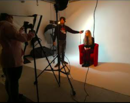
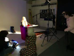
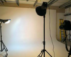
For the first shoot as a team, we put our roles to the test by setting up the studio lighting we firstly set our attention to the lightbox as we weren't off to a good start to the fact it was old and well used but hasn't been used for a while because the first bulbs blew up-on us but we were lucky that the was a second bulb built into the lightbox set up for backup.
We first tried to have it set facing straight on facing the model however it became a bit of an issue due to being in the way and behind the photographer, so we moved so it was side-on from the right-hand side. Which worked out better for all of us because it provides light on to the backdrop and the chance to add more colour onto the backdrop so the was less editing to do later.
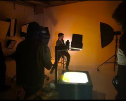
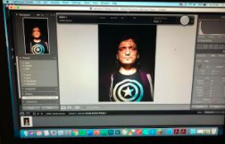
Beforehand Chloe gave herself the task with using a black flipchart pen to wright on the acetate (a clear A4 plastic) but then, later on, we found out that it black wasn't coming out dark enough to show up when we project it as the writing looking a faint, but we managed to out a way to fix this by getting a black marker pen which worked out a lot better since we were finally able to see the text more fine and clear. We did all this as we wanted writing going across the models face.
As we managed to get everything in place until the second bulb inside the lightbox went on us. towards the end of this shoot, I finally worked out an alternative was to have the writing to show up on the model face where we had the model just simply had the model to hold up the text against their face or even have coved around.
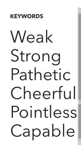
Behind the scenes photos


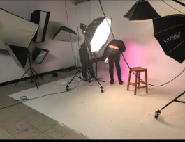

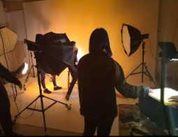


For this shoot, we had the three different light sources besides the projector the first one being the main light with a large Octa softbox attachment to light up the model but mostly the left-hand side we were mostly focusing on lighting up that side of her face since we wanted the mood for the final outcome of the pedicure shoot to have a positive vibe coming from it. A secondary light was used to help light up the background and the model.


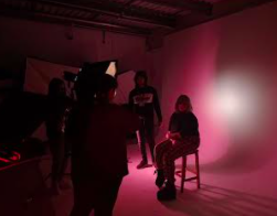
Second photoshoot
For the second photoshoot, we wanted to change things up completely as we planned to change the mood.

Third photoshoot
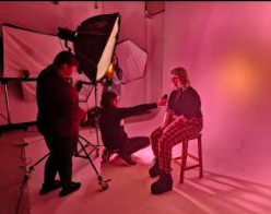
For the third photoshoot, we needed a different model so I had to step in as the model with this shoot they tried writing on my face. for the lighting, we managed to learn from the last few photoshoots and made sure that we had enough lighting so that we could see the face better also see the words on my face. Firstly we chose to do butterfly style light we meant that we had to use the beauty dish attachment however we felt like the background wasn't well lite but we wanted a and I was told thought out the photoshoot to do some natural facial expressions.
When they were writing on my face I was asked about some of my insecurities which lead to them being written on my face.


Fourth Shoots
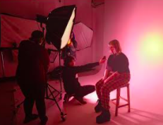
We as a group ended up doing that originally planned, we shot two different people using a lot of colourful makeup. We also applied a bright colour background to match the makeup. The second had no makeup and no background light up. We used the softbox to create butterfly light effect (see below)


The diagram shows the butterfly lights effect.
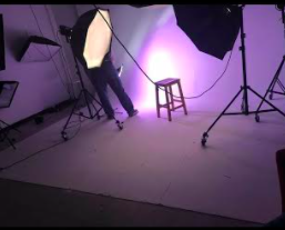
We used a blue gel piece on a small light to directed blue lighting onto the background this match the blue makeup that Beth on Amelia. The direction for this shoot was for Amelia to smile, laugh and shine positivity. We wanted to carry on recreating the light style with the previous shoots creating a uniform effect. We wanted to aim to bring the colours out of Amelia's face because the lighting was too dark during the shoot. To do this Amelia holds a reflector below the frame of the camera to remove the shadows from underneath her face.
The second half of the shoot had Amelia without any makeup on and we turned off the background lighting as well the make the shoot darker. However, we decided the Amelia's face wasn't light up enough but this can be fixed in post-production.

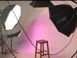
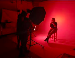
Fifth shoots
For this shoot, we used yellow and gold tones for both Michaela's makeup and the lighting. The was to create a positive feeling toward the image. For the negative shoot, we turned off the background light and asked Michaele to pull negative facial expressions including scowling.
I felt like the makeup tone should have been swapped around due to Michaela having natural tanned skin, therefore, the blue would have shown up better. Yellow light and makeup blends in on tanned skin too much the first image on the left didn't have the reflector and shows the makeup better, however, the face wasn't illuminated enough.

Due to the impact of the COVID 19, we will be unable as a group to meet the deadline set
we are unable to print off our poster and have on show for people to see...
we are not longer to do more photoshoots so we got more of a range of images to pick out from when we are creating the poster.
We had to create a group chat to continue talking about the projects, due to Billie being stuck at home with no wifi she is unable to send us the finish posters. This will have to be fixed in post-production as we couldn't complete the shoots due to the lockdown. it had been very hard to carry on making this shoot by the social distancing.
( Video Below shows what was said in the group chat.)
Editing
The editing side was done by Billie as she was given the task of making sure all the images were edited right and finding out what text style would stand out and be easy to read.
Group chat talking about the project
Building the poster
What makes a successful campaign
In our group chat, we used a poll survey to decide which social media platform would be better to reach our target audience. The survey shows that Instagram was the most popular.


This is the group chat talking about the social media campaign.
Ideas for promoting


The sensitive topics that will be discussed will include issues of mental health such as people's insecurities. We will also show words that are used to highlight people's own feelings about themselves which can include offensive words/topics.


Zine
A Zine different to a magazine, as magazine tend to be regularly produced every day, week or month. However, A Zine is a published booklet produced independently and is normally photocopied and made by hand.
The word Zine comes from a fanzine and these started in the 1920s. Zines tend to be smaller publications than magazines and our usually not mainstream but have cult status or small not mainstream market also known as a niche. The are no rules to publish a Zine and so they are normally very creative. Zines are always self-published and often have strong rebellious ideas.
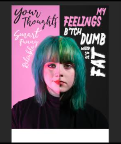
Final outcome and summarily
The final outcomes were unable to be completed due to the lockdown. However, the diagram below shows what the basic idea would have been if we were not in lockdown.
The diagram of the face would have been of the models photographed face, the first shoots of the model would have had positive all over the face, and the second shoot would have had negative words all over the face. During the editing stages, it would have been decided exactly how this would have looked. In addition to this, the final outcome would have two faces spliced together so the image would show a negative and a positive on the same model face ( see diagram below.)
Amelia research mental health, looking at different organisations and information that we could use for the posters. This would be converted in a QR code to enable people to access mental health information instantly. The QR code will place at the bottom of the poster with a hashtag so people can find this information online. Our plan is to get people talking about mental health and insecurities so that they can support each other. A number of these layouts using different models would have been produced with the QR code on each one.


Comments